What winners actually say
Words
The headline, the page title and the button labels from 307 award-winning home pages, read straight off the pages themselves. How long a winning headline runs, what it claims, whether it speaks to the reader at all — and the 78% that never do.

The short version
- 1Keep the headline to about five words.
That is what winning headlines run to.
- 2Name the thing.
Most winning headlines say what the site is, more often as a label than as a sentence.
- 3Speak to the reader to stand out.
Almost four in five winning headlines never say “you” or “we”.
- 4Write every button label on purpose.
There is no shared vocabulary for buttons among winners. Each label is a decision.
- 5Put the headline in the page itself.
Nearly half of winners show no headline until their scripts run, so search engines and AI assistants never see it.
The detail
Read them cold
Twelve First Screens, Word for Word
Twelve headlines as they were written, best-scoring first. Read together they show what the field has settled on: about 5 words, more often a label than a sentence, and in four cases out of five containing no you and no we anywhere. What a winning first screen mostly does is name the thing — not make a promise to whoever is reading it.
Every line links to that winner's record. Taken from the served HTML, so what you are reading is what a crawler reads.
The shape of it
Measured, Not Remembered
The oldest instruction in writing for the web is to address the reader. 78% of these headlines never do — no you, no your, no we, no our. The rest of the figures say what a winning first screen ships instead: a headline of 5 words, a page title using about half the room a search result gives it, and, for 45% of them, no headline at all until the JavaScript has run.
Hover any figure for what it counts. Word choice is measured on the 260 headlines declaring English only; length on any Latin-script headline. Read by build/words.mjs, which caches per site.
Six ways to open
The Move, and Who Makes It
Each way of starting carries how often a studio portfolio uses it beside how often client work does. The gap between those two columns is the useful part: it is the same writers doing a different job, and what separates them most is whether the company is allowed to be the subject of its own headline.
The fragment
46% of portfolios vs 55% of client work
Five words or fewer, making no claim. A name for the thing, set large.


The default. Reads as confidence when the picture behind it is strong, and as nothing at all when it is not.
The flat statement
23% of portfolios vs 26% of client work
A whole sentence, closed with a full stop. Not a slogan — a claim.


Punctuation is a decision. A full stop says this is an assertion you could argue with.
The name
17% of portfolios vs 14% of client work
Says who is speaking, inside the headline itself.


Cheap if the name is known and a wasted first screen if it is not.
Talking to you
8% of portfolios vs 14% of client work
Uses you or your. The reader is in the sentence.


The move most often advised and, on this evidence, among the least used.
The command
6% of portfolios vs 12% of client work
Opens on a verb and tells you to do something. "Start for free." "Meet the new one."


The shortest possible distance between a headline and a click, which is also why it is the easiest one to write badly.
Talking about us
21% of portfolios vs 6% of client work
Uses we or our. The company is the subject.


The one place where a portfolio and a client site genuinely part company.
One headline can make several of these moves, so the rates overlap rather than divide up a hundred. 71 portfolios against 189 client sites, English only.
Saying who you are
One Line, About Yourself
The hardest headline anyone writes is their own. These are studio and designer portfolios — the same people who write the client sites above, with nobody to approve the copy and no product to describe.
Studios' own sites are kept out of every other number on this site, so that people advertising themselves cannot pull the trends around. This page and Portfolios are the only two that read them.
The shortest copy on the page
What the Buttons Are Asked to Say
Every label on a button, or on a link dressed as one, across 313 English-language winners — consent banners, players, carts and language switchers taken out, so what is left is the site's own writing.
There is no shared vocabulary. 1231 distinct labels came off 313 sites and the commonest appears on 23 of them, about 7%. Nothing on this list is a convention, which means button wording is a decision every time rather than a default anyone will recognise on arrival.
The most emphasised words on a winning site are also, mostly, places to go rather than things to do — contact, about, subscribe. The asks start further down the list, and they get more specific as they go.
A page with fourteen "learn more" buttons contributes one. Read from the served HTML, so anything a script inserts later is not counted.
When the words are the picture
Set Large Enough to Be the Design
At this size a headline stops being copy and becomes the composition. The words carry the layout, so the sentence has to survive being read at a glance and from across a room — a different test from the one a paragraph has to pass, and the reason a line that reads well in a document can collapse at 200 pixels tall.


Winners tagged typography — where the words are doing the work a picture usually does.
Being written about now
29 Pieces on Writing, This Week
Live from 5 feeds about the words rather than the picture: landing-page copy, content design, and the trade arguing with itself about how to write.
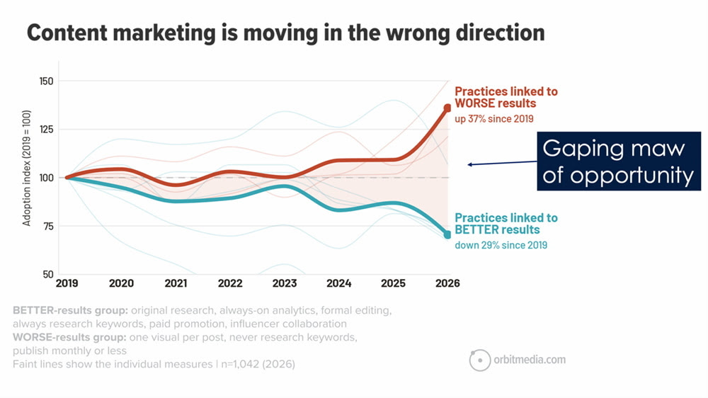 New Data Just Dropped! Latest Blogging ResearchAnn Handley
 Don’t Outsource This Part of WritingAnn Handley
 How To Secure More Speaking GigsAnn Handley
 Why your SaaS demo landing page isn’t converting (7 mistakes to fix)Unbounce
 Sales and marketing alignment lessons from 500+ SMBs (2026 Report)Unbounce
 How to build SaaS comparison pages buyers actually trustUnbounce
 40 best landing page examples of 2026 (for your swipe file)Unbounce
 How to Use Claude Code for UX WritingUX Writing Hub
 13 proven lead generation strategies and tactics that workUnbounce
 How to build a CRO strategy (that actually works)Unbounce
- SEO That Gets At The Heart of the QuestionAnn Handley
- The New Siri’s Biggest Strength Is Not IntelligenceNN/g
- Context Libraries: How AI Power Users Manage Context EngineeringNN/g
- When Should You Disclose AI Use? The PACED FrameworkNN/g
- AI Can Help Write an Article, but It Can’t Stand Behind ItNN/g
- Make Posteingänge Sexy Again: 9 Ingredients for an Email Readers Want to OpenAnn Handley
- The Custodial Era of UX: Cleaning Up After AINN/g
- AI Slop, Accusations, And A Better WayAnn Handley
- Positioning 101: How to live rent-free in your best clients’ mindsCopyhackers
- Agentic Content Design: How to Build Your First GuidelinesUX Writing Hub
Copyhackers and NN/g publish no pictures with their feeds. They are the standing authorities on web copy and on microcopy respectively, so they are listed here rather than left out.